Redesigning The Taunton Minster's Visitor Guide to be more visually appealing, less text-heavy, and more consistent with the church's branding. The Visitor Guide was supplemented with photography taken by myself.
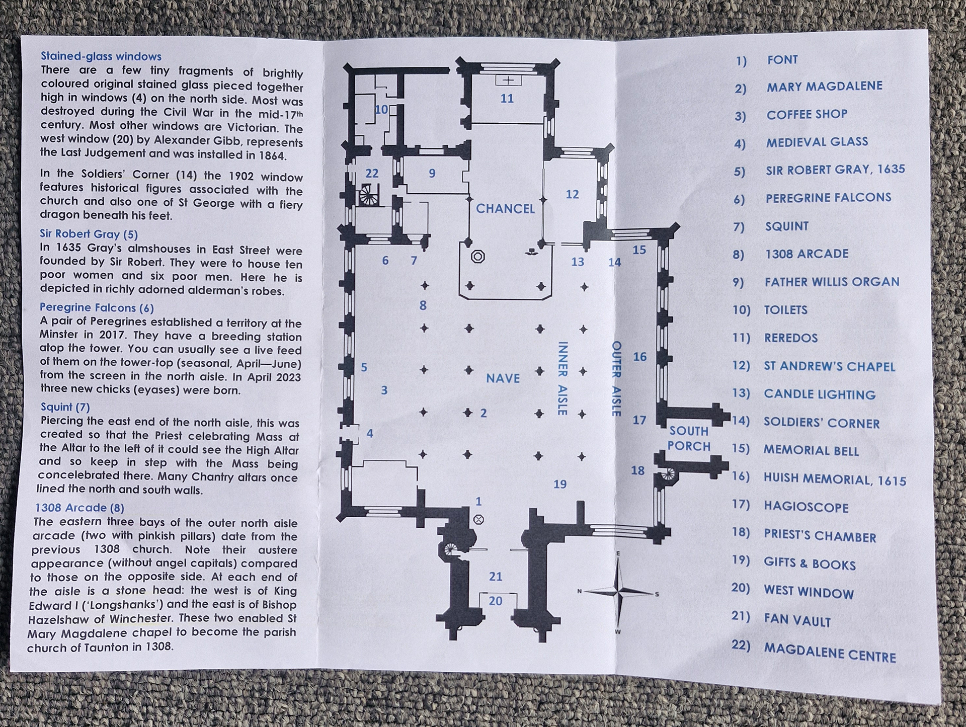
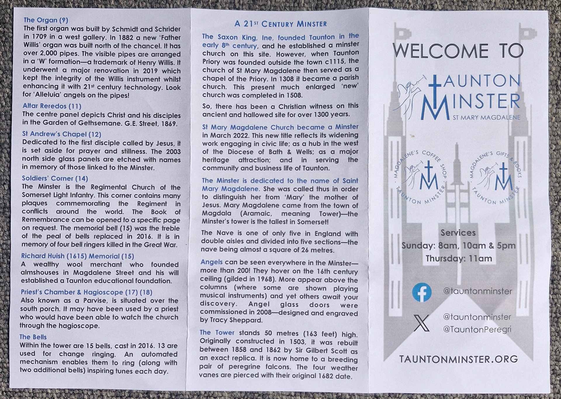
The old leaflet was text-heavy and unappealing to visitors with a real lack of any visual cohesion. Although the leaflet spoke about the Minster's beautiful architecture, it did nothing to highlight this for it's reader. The cover was busy and lacked the visual features to encourage visitors to pick up the leaflet and learn more about the Minster.


